 Over the last year on GOV.UK, we’ve been looking for ways to make our forms easier to use by improving the checkboxes and radio buttons that people need to click on.
After launching an improved style for the radio buttons and checkboxes, we initially experienced some browser issues that prevented the new styles from displaying correctly. We’ve now managed to overcome these issues but only by customising the form controls used by browsers.
Getting browser vendors to fix their bugs
In October we filed issues with various vendors about radio buttons and checkbox bugs in their browsers. Unfortunately, with the exception of Opera, these bugs have not yet been fixed.
Some of the bugs we filed were just about visual polish. But, during user research sessions, we found a bug in iOS that was confusing for users. This bug means that when you resize a radio button, instead of rendering a bigger circle the browser adds straight lines in between the normal sized corners (as you can see from the below).
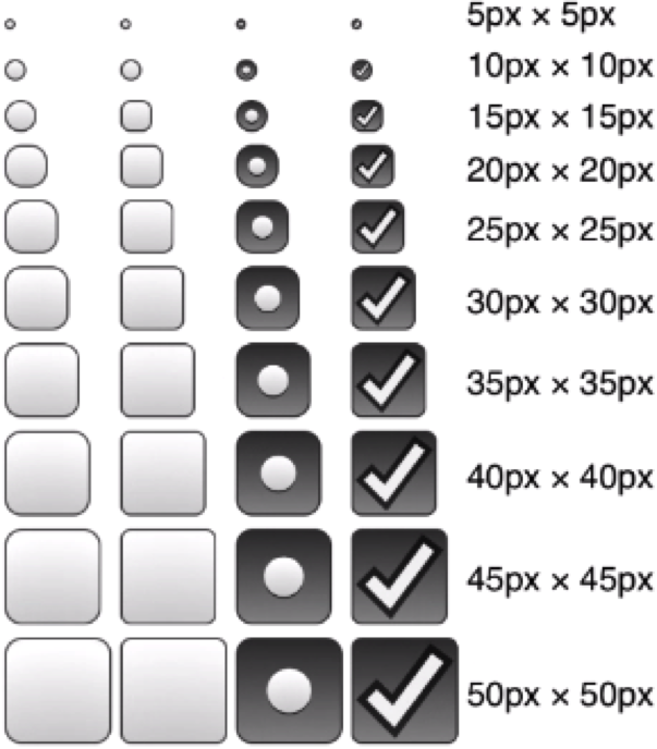
Users find it hard to distinguish these big radio buttons from big checkboxes (and they need to be able to do this on forms so they can understand how many answers to give). Seeing as iOS users make up around a quarter of the visitors to GOV.UK we were unecessarily causing problems for a lot of people.
Other bugs present included small and non-resizeable inputs in Firefox on Windows, and in Chrome and Safari on macOS. Chrome and Safari on macOS also suffered from a bug where the inputs jumped up and down when they were selected.
We weren’t meeting our user’s needs with all of these problems, and needed to try a new approach.
A new style for radios and checkboxes
If we can’t rely on browsers to produce working radios and checkboxes, then what can we do? We can build our own custom ones. Usually, we’d rather use native browser form controls, but in this case the native controls have some serious bugs.
We started with a pre-existing design that we’d developed and started testing a couple of years ago. This looked similar to the Internet Explorer controls, and was relatively easy to build out over the existing HTML.
You can read Tim Paul’s blog post on updating the design of the radio buttons and checkboxes for more detail.
Technically, the implementation is reasonably simple. We hide the native control, but leave space for the custom control to appear. We then use CSS generated content hooks: the first for the container and the second for the checked mark. We generate these with borders and transformations instead of using images. This keeps things sharp on high resolution displays and reduces the page weight.
We want to easily transition as many GOV.UK services over to the new style as quickly as possible, so we made the decision to rely on a small piece of JavaScript rather than make a change to the HTML for the look and feel. In the event the user doesn’t have JavaScript available the radio buttons and checkboxes fall back to their browser’s native ones (with the same size if that browser supports it).
The colour of the new radio buttons and checkboxes will match the text colour, and their background is transparent. This works better for people who change their browser’s default colours, or those who use high contrast themes in Windows.
While we have a list of recommended browsers and devices that services should test in, it’s important that libraries of interface code go further. We’ve tested back to early versions of all of our common browsers, and many rarer ones too. In Internet Explorer 6-8 the user will see their browser’s native controls as those browsers don’t support the technology we’re using to build the custom controls. More modern browsers can support the custom controls .
Making custom controls accessible
One of the reasons why we generally avoid custom form controls is that browsers build in a lot of accessibility features to their native controls that are important to replicate.
When making our updates, we solved a lot of the potential problems by reusing a visually hidden native control. The custom controls we have built are invisible to screen-readers, but they have access to the underlying native technology.
We did run into a problem with a class of assistive technology that is not often considered when building websites: speech recognition software.
The market leader for this is Dragon NaturallySpeaking. Version 12 worked fine with the new radio buttons, but version 13 failed to recognise the inputs – the user couldn’t click on them. We narrowed this down to the code we were using to hide the native controls. As soon as we reduced the control in size to near-invisibility, or positioned the control outside off-screen NaturallySpeaking was unable to interact with it. We solved this issue by making the control completely transparent, which meant NaturallySpeaking 13 was able to recognise it.
Rolling it out
Making new radio buttons and checkboxes is no use if no-one can use them.
Designers prototyping new government services can use version 5.0.0 or up of the GOV.UK Prototype Kit to use the new inputs. Developers on government services can use them by using version 2.2.0 or up of GOV.UK Elements, our library of service patterns. Existing inputs will automatically get the new look and feel.
With a site as big as GOV.UK there will be a lag as individual services upgrade to the newer style. Since making the radio buttons and checkboxes available, the Department for Work and Pensions have upgraded the Job Centre service ‘Prove you can apply for benefits in the UK’ to use them and have had good feedback. There are new services being developed by the Department for International Trade and the Land Registry, and the NHS beta team are trialling them. We have also updated GOV.UK Verify to use the latest version of the inputs.
We would still like vendors to fix the bugs in their browsers. If, in the future, we can resize radio buttons and checkboxes without any problems then we may change back to using native controls. For the present, our custom controls provide the best experience for people using our services.
If you manage a government service and you’re unsure how to implement these custom controls then leave a comment and we’ll get in touch.
You can follow Robin on Twitter, sign up now for email updates from this blog or subscribe to the feed.
If this sounds like a good place to work, take a look at Working for GDS - we're usually in search of talented people to come and join the team.

4 comments
Comment by Barney posted on
Hi Robin,
Thanks for sharing the ins and outs of how this solution came up. I remember facing similar issues ten years ago when I implemented the front end for http://archaeologyuk.org/accessible/ — it's shocking that something as obvious as increasing the size of form controls still requires such elaborate techniques.
I was intrigued to read this:
> We want to easily transition as many GOV.UK services over to the new style as quickly as possible, so we made the decision to rely on a small piece of JavaScript rather than make a change to the HTML for the look and feel
What was it about this particular change that made speed so essential? Now that you have successfully deployed the change across the board as a Javascript enhancement, do you intend to progressively update individual instances to implement the change statically? Do users without Javascript form a significant chunk of GDS users?
Comment by Robin Whittleton posted on
While GOV.UK looks like a single site from the outside it’s built by lots of different teams all working on their own code. From a users point of view it’s important to have consistency of look and feel, but we can’t push new styles out automatically to those those. We rely on them to integrate them manually, and for that we need to keep the update process as simple as possible. For the future we’re planning to ship HTML as drop-in components which would make it easier for teams to update their markup, but that’s a little way off.
The last time we checked (https://gds.blog.gov.uk/2013/10/21/how-many-people-are-missing-out-on-javascript-enhancement/) we found that about 1.1% of our users didn’t have JavaScript available. We’re planning to re-run the research behind that blog post soon to get up-to-date figures, but we don’t expect that value to have changed dramatically. At current visitor levels, that’s in the region of a million visits a month without JavaScript available.
Comment by Philippa posted on
Hi Robin,
I'd like to know how departments can make use of this form - it's for services rather than a content format right? We're in the process of re-designing our contact us form and I'm wondering if we can use the functionality you've developed and simply build an API to connect responses with our CRM system.
Comment by Robin Whittleton posted on
You can use these inputs by using GOV.UK Elements (http://govuk-elements.herokuapp.com/). That’ll just give you interface elements though, no other functionality. You’ll still need to build a system for them to live in.