In GOV.UK's Modelling Services team we looked at the possibility of using sticky functionality as part of our work with step by step navigation elements. Here’s what we found.
Sticky or fixed elements are parts of a webpage that remain in place when the page is scrolled. They’re commonly used to keep key functionality always in sight, such as navigation elements or social media controls (more details on sticky functionality are given here).
How sticky functionality could be used on GOV.UK
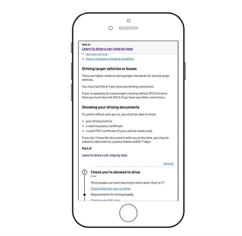
Where a content page is part of a step by step navigation, several components are included on that page. One of them is the navigation header (or step nav header), as seen in the diagram below.
It’s positioned right at the top of the page so users can see it immediately and understand that this page is part of a wider process. It also provides a link back to the main step by step navigation page.
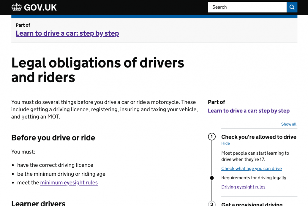
We wanted to make sure that it was obvious to users that the page was part of a step by step navigation. During testing we found that many users didn’t notice the step nav header.
How sticky functionality could be useful on mobile devices
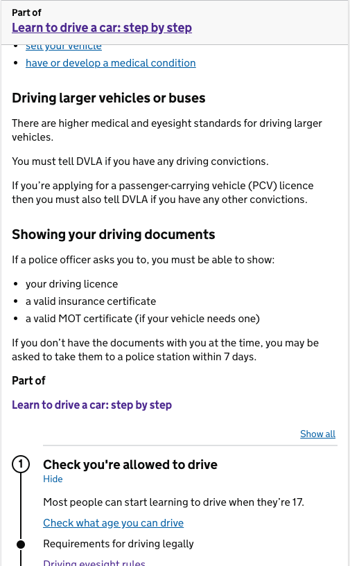
On a mobile device the step by step navigation in the right hand column appears below the main content, which means users have to scroll to the bottom of the screen to see it. This leaves the step nav header as the only immediate indication that the page is part of a step by step navigation. This is of particular concern on long content pages, as mobile users may not scroll all the way to the bottom.
To make the step nav header stand out better, we built a prototype where it would use sticky functionality to remain at the top of the page even when scrolled. This would hopefully improve its visibility to users.
Our approach
Our approach to deciding whether sticky functionality should be implemented included 3 important questions:
- is it useful for users?
- is it reliable across browsers and devices?
- is it accessible?
In order to go ahead with sticky functionality, ideally the answer to all of these questions would be ‘yes’. While none of these categories had overall precedence, a significant problem in any of them could decide the outcome.
Testing with users
Our first test of the sticky functionality was with real users. Some noticed it and used it; others didn’t appear to see it at all. Importantly, no obvious problems were discovered.
While the sticky functionality didn’t prove as effective as we’d hoped, we decided that it was worth further investigation.
Testing with mobile devices
Past experience had shown that sticky functionality could be unreliable on some mobile devices, either being slow to respond to scrolling events or not working altogether.
We took our prototype to a nearby device lab to try to test it with as many different tablets and smartphones as possible, both old and new. We found a range of different problems, some of which occurred on more than one device.
The most significant problems related to zooming. Our concern was that the step nav header would obscure too much of the page when zoomed, but the problems turned out to be much more varied and complicated. Sometimes the header would slowly disappear upwards on scroll when zoomed, or become misaligned after zooming and rotating, or appear slightly cropped.
While the basic sticky functionality worked well on a majority of devices, the zoom-related problems were a concern as there was very little we could do to resolve them.
Accessibility testing
We also arranged a more general accessibility test for the step by step navigation components at the Digital Accessibility Centre in Swansea. Its testing includes input from people with a range of disabilities and access needs, and such testing is highly useful for any digital interface.
We took the opportunity to have the sticky functionality included as part of this accessibility testing and almost immediately discovered a problem.
Keyboard users often navigate web pages using the TAB key to move through focusable elements, such as links and input boxes. The SHIFT + TAB key combination can be used to move through those elements backwards. We found that where the sticky header overlapped the page, navigating backwards through elements often left the focused element obscured by the sticky element.
This was an accessibility barrier for users. The sticky element was preventing a commonly used navigation technique from working properly, leaving users unable to see or read the element they had focused on.
The outcome
At the start of this investigation, we asked ourselves 3 questions: is it useful for users, reliable across devices, and accessible. How did we do?
While it proved useful for some users, it was not reliable across browsers and devices and included a significant accessibility problem. Because of this, we decided that we would not implement it.
Does this mean that sticky functionality should never be implemented? No, but it must be considered and tested carefully, particularly if the sticky element in any way overlaps other content. A safer use would be a sticky element positioned over an empty part of the page, or to have the content scroll in a way that it is never overlapped by the sticky element.
The outcome of this tale may seem unsatisfying. We identified a need, proposed a solution, then found it didn’t work. But this isn’t a bad outcome. Although the solution wasn’t suitable, we found solid reasons why that was so and learned a great deal in the process. More importantly, the evidence we gathered has since helped to inform other work, and we avoided creating an accessibility problem on GOV.UK.
To make sure you stay up to date with all the latest developments, you can sign up to alerts from the GDS Technology blog.
If this sounds like a good place to work, take a look at Working for GDS - we're usually in search of talented people to come and join the team.

3 comments
Comment by Alastair Campbell posted on
In terms of accessibility testing, did you consider low vision users who zoom in?
That generally works very well on Gov.uk, but sticky headers can dominate your view if it assumes a portait layout. When people zoom-in on a laptop/desktop a 50px tall header can take >30% of your view, so it helps to use a vertical media query to un-stick the header if the user doesn't have much height to play with.
Comment by Jonny posted on
I have to say as a fellow UX researcher it's really helpful when you guys report on the less successful stuff.
I find reports on what didn't go so well (and the lessons from them) more useful than the wins!
Comment by Andy Sellick posted on
Hi Alastair, thanks for your comment. Yes, testing with low vision users who zoom in was part of the testing done at DAC. I didn't include more details of that because there was already a bit about zooming in the mobile testing section. But yes, including a vertical media query is a good way to handle that.