
As GOV.UK Pay continues to grow, we need to make sure our apps can handle the increased amounts of traffic, transactions and visitors. We also need to make sure our developers can make frontend improvements quickly and easily.
I recently finished migrating to the GOV.UK Design System. This has helped us to:
- reduce our code base by 1,400 lines
- cut down the number of CSS files we use from 4 to 1
- increase accessibility by letting users change colours
- benefit from all the improvements introduced by the GOV.UK Design System
As we carried out the Design System migration alongside mission critical work, the process happened gradually over 4 months. But if we had needed to migrate urgently, we could have done it in a 2 week sprint with someone working on the project full time.
Why we decided to move to the GOV.UK Design System
Last year we did a performance audit and found our template rendering engine was out of date and unsupported.
We were using a variant of Mustache templating called Hogan.js which was last updated in 2015. We decided it was time to choose a new template engine and after considering our options, we chose Nunjucks because it was:
- faster at template rendering
- open sourced and supported by the Mozilla Foundation
- the same engine the GOV.UK Design System team uses for its frontend framework, GOV.UK Frontend
I was fairly new to GOV.UK Pay when we migrated to Nunjucks. This was a great way to learn the intricacies of the Pay codebase, as I had to interact with 180 templates during the transition.
Before the GOV.UK Design System we were using the now deprecated frontend frameworks which consisted of 3 NPM modules:
- govuk-elements-sass
- govuk-frontend-toolkit
- govuk-template
We had our own specific Sass (CSS) and JavaScript (JS) on top of these modules.
How we migrated incrementally
GOV.UK Pay has 4 Node.js microservices, which provide the frontends for our users to interact with. We wanted to make sure the transition to GOV.UK Frontend did not interfere with other work or create a few large pull requests.
We decided to use the old and new frameworks at the same time and transition one template at a time. This caused the least amount of disruption for users and development teams. It also allowed us to perform the migration on top of core mission work.
We started by loading in the NPM modules for both frameworks. We had 2 base templates and we could transition any template to the new system by changing the base template it inherited.
For example:
{# OLD - govuk-template #}
{% extends "layout.njk" %}
{# NEW - govuk-frontend #}
{% extends "layout-new.njk" %}
After switching the base template from ‘govuk-template’ to ‘govuk-frontend’ our rendered pages were unstyled as none of the classnames matched up. I had to update classes and elements on the pages that I switched.
For example:
Title
was manually changed to
Title
Making these changes were easy but time consuming.
Using macros and components
One of the great features of GOV.UK Frontend is the component macros the team has made.
Macros allow us to use predefined, reusable chunks of markup. They are easier to read and make files smaller. If a component is improved over time, we can get the benefit across all our templates and markup by updating just the NPM module. This makes it much quicker for us to update GOV.UK Pay’s frontend because the macros generate the markup for us.
An example of a macro:
{{
    govukButton({
      text: "Continue"
    })
}}
The macro would output:
<button class="govuk-button" type="submit">
  Continue
</button>
Using the components and normal classes alone was not enough as we needed more control over the layout. I ended up using the override classes a lot, which I was familiar with from using the atomic style classes in Tachyons. This helped me to write as little custom CSS as possible by using the Design System’s components. I could also use override classes to build custom components, for example:
- Payment description:
- {{ product.name }}
Updating templates
I migrated the templates for our 4 services one by one, switching them over to the new style. While it was time consuming, once I’d got into a groove I could rattle off the classnames from memory and could migrate a template quickly.
When I came to a component I could not replicate with the GOV.UK Design System or override classes alone, I would add a Sass file to style that component correctly. I used the Block, Element and Modifier (BEM) methodology - the chosen methodology used in the Design System - to write CSS and tried to keep it as generic as possible. GOV.UK Frontend also has lots of useful mixins and functions to keep code consistent, such as the govuk-spacing() function:
// cookie-banner.scss
.cookie-banner {
  box-sizing: border-box;
  width: 100%;

  padding: govuk-spacing(3);
  background-color: lighten(desaturate(govuk-colour("light-blue"), 8.46), 42.55);

  p {
	margin: 0;
  }

  @include govuk-media-query($media-type: print) {
  	display: none !important;
  }
}

.cookie-banner--hide {
  display: none;
}

Streamlining GOV.UK Pay’s JavaScript
Using the GOV.UK Design System also meant client-side JavaScript did not depend on the jQuery library anymore. We stopped using jQuery for GOV.UK Pay client-side JavaScript a while ago because it was unnecessary and added page weight. But as there were some legacy components like the multiselect dropdown still using the jQuery, our migration seemed like a good time to remove it completely.
Any modules we found which used jQuery were refactored to remove it as a dependency. We found the youmightnotneedjquery.com tool was useful here. After approximately 50 pull requests we were fully transitioned to the Design System, so it was time to measure the difference in page performance.
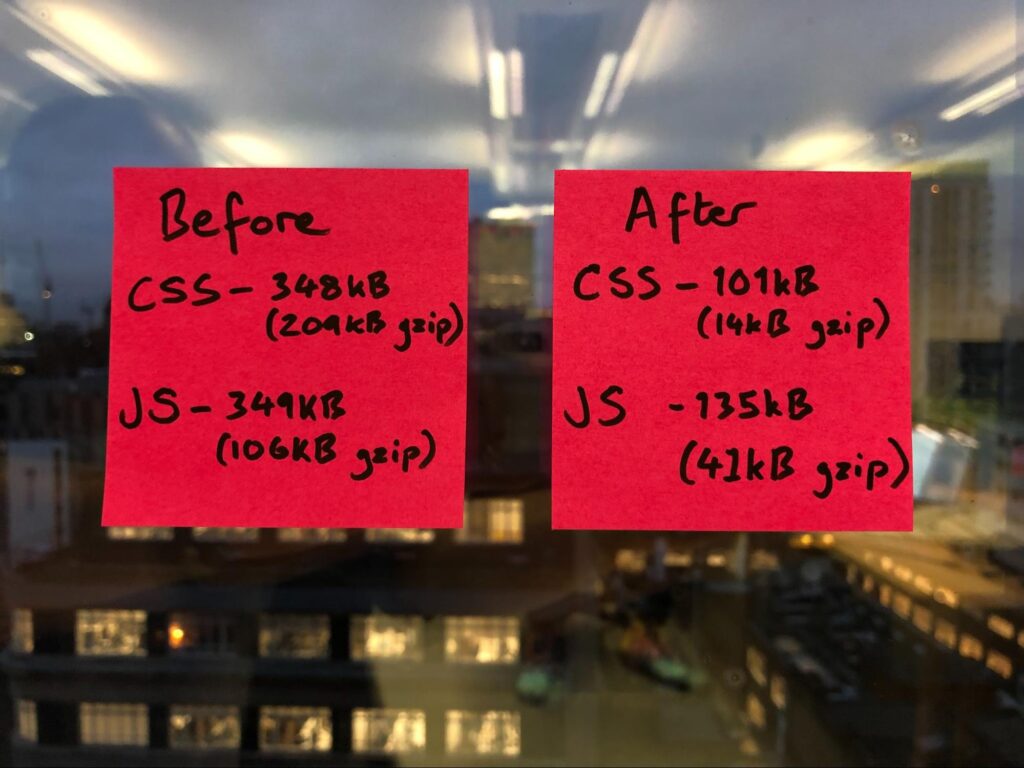
Performance benefits of using the GOV.UK Design System
We measured performance before and after our migration to see how our changes had benefitted GOV.UK Pay.
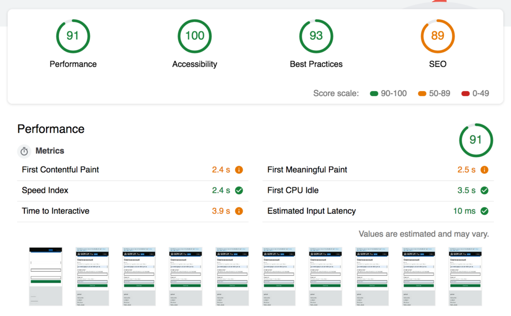
I ran a Lighthouse Audit as a baseline before the migration and we had a respectable score of 91 out of 100 for performance.
After migrating to the GOV.UK Design System our lighthouse score reached 99/100.
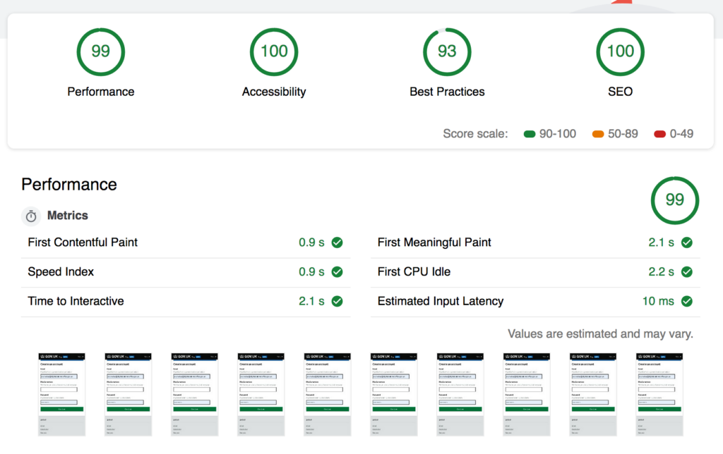
The biggest change was the reduction of the CSS and JavaScript file sizes. On a mobile with a 3G connection, our first meaningful paint was reduced by 62.5%, from 2.4 seconds to 0.9 seconds, which is a stunning improvement.
Other benefits of using the GOV.UK Design System
By using the GOV.UK Design we can now:
- use one GOV.UK dependency instead of 3
- make sure our apps are uniform with the rest of GOV.UK
- maintain our codebase easily and keep our outputted CSS file small
- use ready-made component documentation on the GOV.UK Design System, which saves development time and reduces technical debt from accumulating
Our next steps
We’ve already contributed some new functionality back into the Design System. We’re also planning to contribute components like our currency input, which we think will benefit other departments.
If you want to learn more about the GOV.UK Design System, or you have any questions you can contact the team on the cross-government Slack or via email govuk-design-system-support@digital.cabinet-office.gov.uk

7 comments
Comment by Malcolm D posted on
You may have the Lighthouse Audit inline graphics the wrong way round.
The 99% diagram is shown after the text that reads "I ran a Lighthouse Audit as a baseline before the migration and we had a respectable score of 91 out of 100 for performance." and the 91% one is shown after the text that reads "After migrating to the GOV.UK Design System our lighthouse score reached 99/100."
Comment by khidr posted on
Thanks for pointing that out Malcolm - we've swapped it around.
Comment by Victor posted on
Great results! It is commendable that there are still developers who are thinking about optimization. Too bad the big guys don’t care about that.
By the way, looking at the Lighthouse Audit screenshots you scared me a lot, because it seems that now it has become worse. I think you should swap them 😉
Comment by Ian Maddison posted on
Great work! That first contentful paint time reduction is awesome, definitely need to try nunjucks for my next project.
Comment by Badger of Deploy posted on
what about the badger?
Comment by Jonny posted on
Amazing work guys!
Comment by Andy Jones posted on
Fantastic work!!