Improving forms with new radios and checkboxes

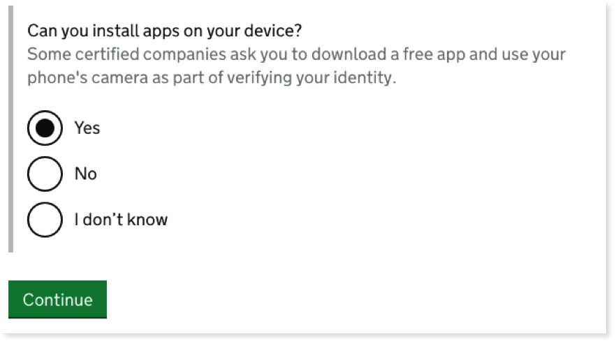
Over the last year on GOV.UK, we’ve been looking for ways to make our forms easier to use by improving the checkboxes and radio buttons that people need to click on.

Over the last year on GOV.UK, we’ve been looking for ways to make our forms easier to use by improving the checkboxes and radio buttons that people need to click on.

GOV.UK gets a lot of visits from people in the UK and further afield. We keep a record of all visits and use this data to support as many users as possible. Deciding which browsers to test We’ll try to …

There seems to be a common belief among front-end developers that progressive enhancement is either old fashioned or has simply been replaced by single page applications. This is a problem of perception. We’d like to explain why we use progressive …

We thought we’d try and explain the approach we’ve adopted to hiring and nurturing the right development skills. We realise it may not be clear to those not part of GDS why we solely advertise for full stack developers but …
When trying to develop a site with a consistent look and feel it’s common to develop a style guide with patterns which can be reused across the site. This lets designers easily reuse standard patterns and lets developers know how …
We have a grid we use on GOV.UK which is based on percentage width columns (multiples of either 25% or 33% of the container width) with a 30px gutter between the grid columns. The columns on narrower devices shrink appropriately …